Cumulative Frequency
Cumulative Frequency
Cumulative frequency is a way of organising data to show the total number of values that fall below a certain point in a dataset. It is calculated by adding up the frequencies of each category progressively, creating a running total. This method is useful for understanding trends, identifying medians, and analysing distributions in large data sets. Cumulative frequency graphs, often drawn as smooth curves, help visualise how data accumulates over time or within a range, making them valuable in statistics and real-world applications like exam results analysis or income distribution.

Understanding a Cumulative Frequency Table
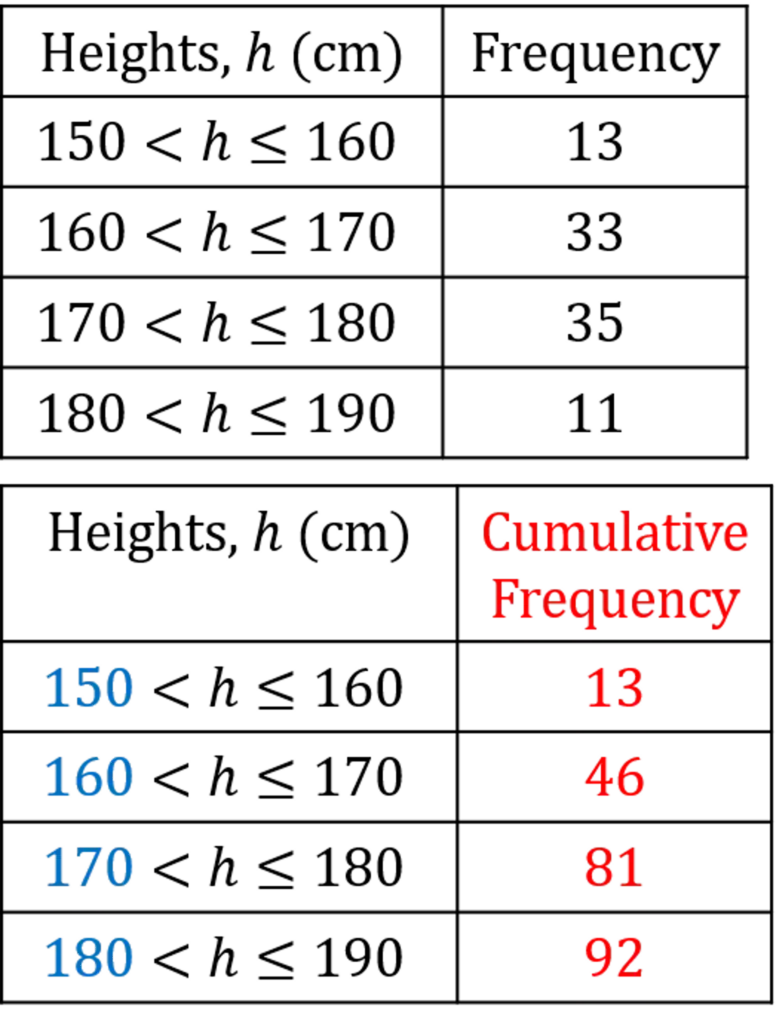
The table shows height ranges (e.g., 150-160 \text{ cm}, 160-170 \text{ cm}…) and their corresponding cumulative frequency values.
Cumulative frequency means the total number of values up to a certain point.
For example:
- 13 people have a height of 160 \text{ cm} or less.
- 46 people have a height of 170 \text{ cm} or less.
- 81 people have a height of 180 \text{ cm} or less.
- 92 people have a height of 190 \text{ cm} or less.

Understanding a Cumulative Frequency Graph
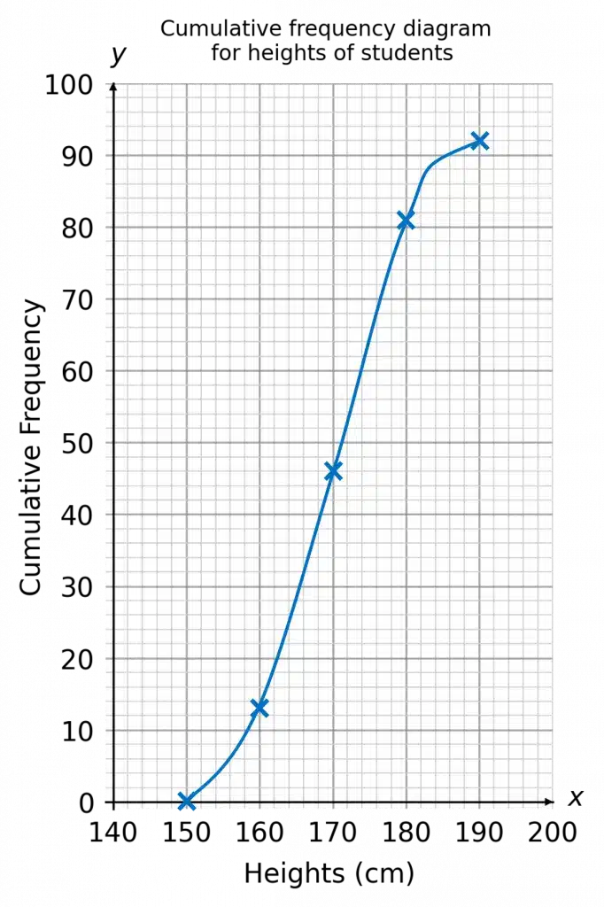
- The \textcolor{#10a6f3}{\boldsymbol{x}}-axis represents the height (continuous data).
- The \textcolor{#10a6f3}{\boldsymbol{y}}-axis represents the cumulative frequency (total number of people up to that height).
- The curve shows the accumulation of values as height increases.
How to Interpret the Graph
- The curve rises steeply in the middle, showing that most people’s heights are around that range (160-180 \text{ cm}).
- It flattens out at the top, meaning fewer people are beyond 180 \text{ cm}.
Cumulative Frequency Example Questions
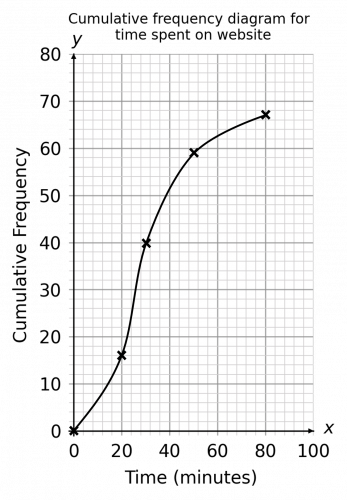
Question 1: How many people in total were asked how much time they spent on the website?
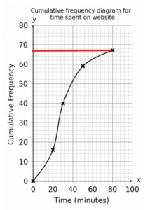 Since cumulative frequency graphs give a running total, we can just look at the cumulative frequency of the maximum value and this will give us the total amount of responses.
From the graph we can directly see this is 67.
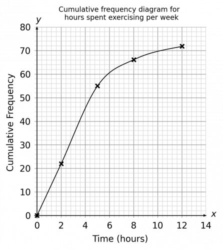
Question 2: How many people spent between 2 and 5 hours exercising per week?
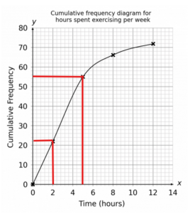 To work out the frequency between a range of values, we need to find the cumulative frequency for the larger value and subtract the cumulative frequency of the smaller value from it.
This will give the increase in the running total between these values which is the amount of responses in this range.
From the graph we can see that the upper value of 5 hours corresponds to 55 and 2 hours corresponds to 22.
Therefore the amount of people who spent between 2 and 5 hours exercising per week is
55 - 22 = 33.
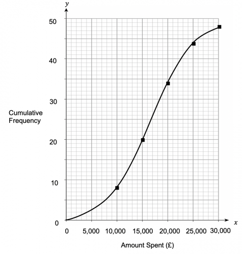
Question 3: What was the median amount spent to the nearest \pounds5,000?
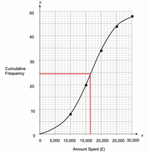 To calculate the median from the graph, we need to first find the total amount of responses. We can see directly from the graph that there were 48.
The median will therefore be the value of the \dfrac{48 +1}{2}th value.
\dfrac{48 + 1}{2} = 24.5
We then read up the y-axis to find that the 24th and 25th values both equal around \pounds16,500 which is \pounds15,000 to the nearest \pounds5,000
